This first map shows the state of the network when the phasing-out of the HLN had started with the introduction of the DTN which was offering more switching power in order to cope with the constant traffic increase; we can see specific features of the network at that time, including the front-end/back-end configurations (such as ISP-NYC or HHP-HKX) used to increase the switching power of the HLSs. We can also note that the first DISs (DPAR and DNYC) had already gone online.

On the following chart we see the transition of the high level Type B network from a meshed network of HLSs to a more centralized Type B network centered around the more powerful MSS systems:

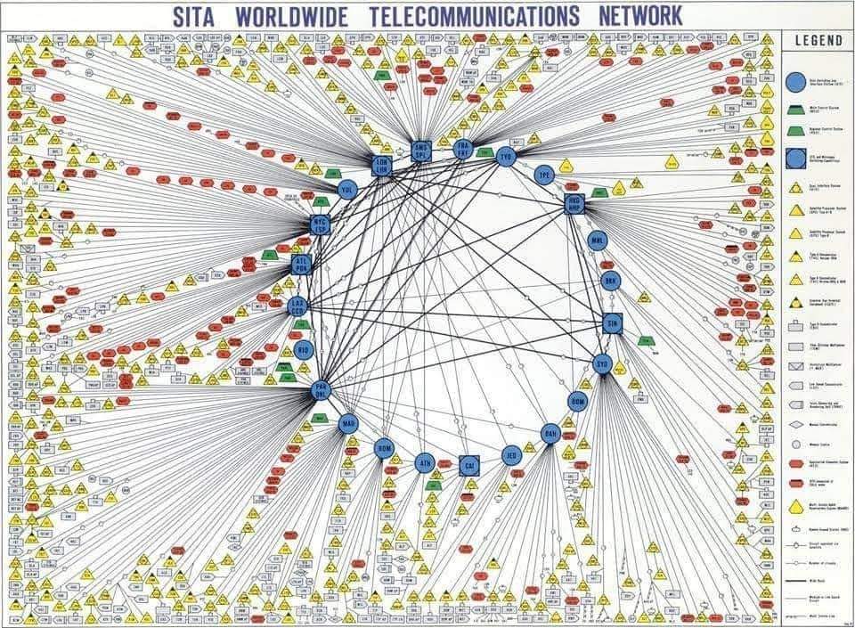
And this third chart shows the extension of the DTN and access networks at their apex. The complexity and extension of the network had become a challenge for the graphic designers to represent it on a single chart!